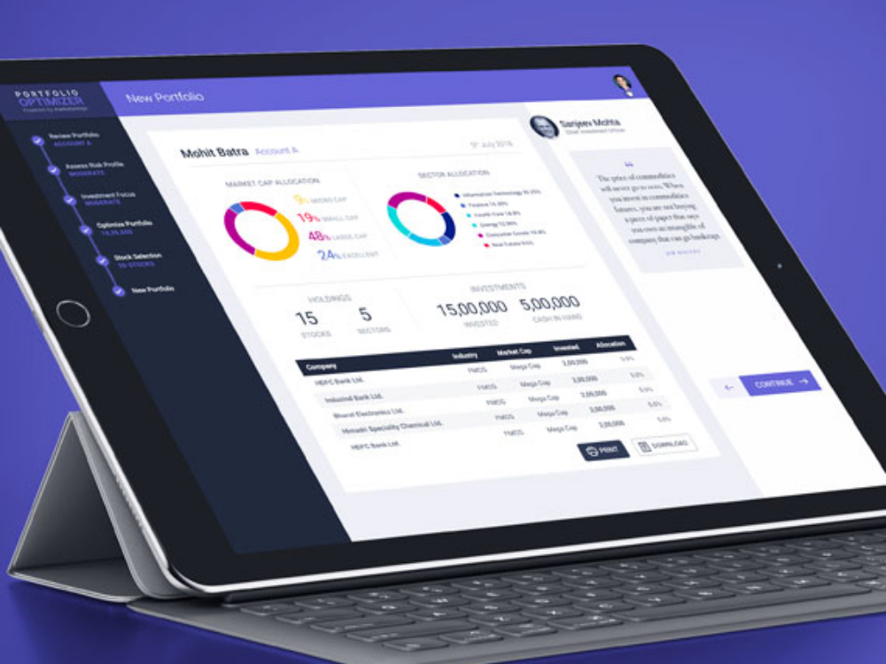
UX/UI Design
Portfolio Optimizer
The Portfolio Optimizer boasts a sleek UX/UI design prioritizing user intuitiveness. Vibrant dashboards visualize asset distributions and predicted returns, while interactive charts trace historical and projected performance. A clean, minimalist layout ensures ease of navigation, while tooltips guide first-time users.
Responsive design adapts to various devices, ensuring seamless access for on-the-go investors. The color palette, inspired by financial motifs, instills trust. Customizable alerts and notifications elevate user engagement, making portfolio management a streamlined, insightful experience.
![](https://jaiwadhwani.com/wp-content/uploads/2023/08/marketsmojo_02.jpg)
![](https://jaiwadhwani.com/wp-content/uploads/2023/08/marketsmojo_03.jpg)
![](https://jaiwadhwani.com/wp-content/uploads/2023/08/marketsmojo_04.jpg)
![](https://jaiwadhwani.com/wp-content/uploads/2023/08/marketsmojo_05.jpg)
![](https://jaiwadhwani.com/wp-content/uploads/2023/08/marketsmojo_01.jpg)
Investing, intelligently redefined.
The Portfolio Optimizer revolutionized investment strategies by analyzing market trends and data, ensuring optimal asset allocation. This dynamic platform adjusts to market fluctuations, offering users data-driven insights to maximize returns, reduce risk, and achieve financial goals with unparalleled precision.